07 | 09
PROJECT
Camo Whiskey
COURSE
Graphic Design One
SEMESTER
Spring 2022
INSTRUCTOR
Jeremy Stout
CATERGORIES
Brand Design
Web Design
Visual System
ADAPTABLE
In nature, adaptability is a key characteristic for survival. Drawing inspiration from a natural phenomenon like camouflage—where the next steps are uncertain, yet the ability to understand, mold, and evolve is crucial—flaunts creative strength. Adaptability became the central theme in creating and designing the Camo Whiskey brand.
OBJECTIVE
The project is designed to challenge and develop your skills as a designer, encouraging you to push your craft through research and connection. By taking a natural phenomenon and adapting it through careful research and multiple stages, the goal is to create a well-designed logo, an individual color palette, a compelling storyline, and a cohesive product and brand. The final brand identity needed to effectively connect with and showcase the phenomenon.
SOLUTION
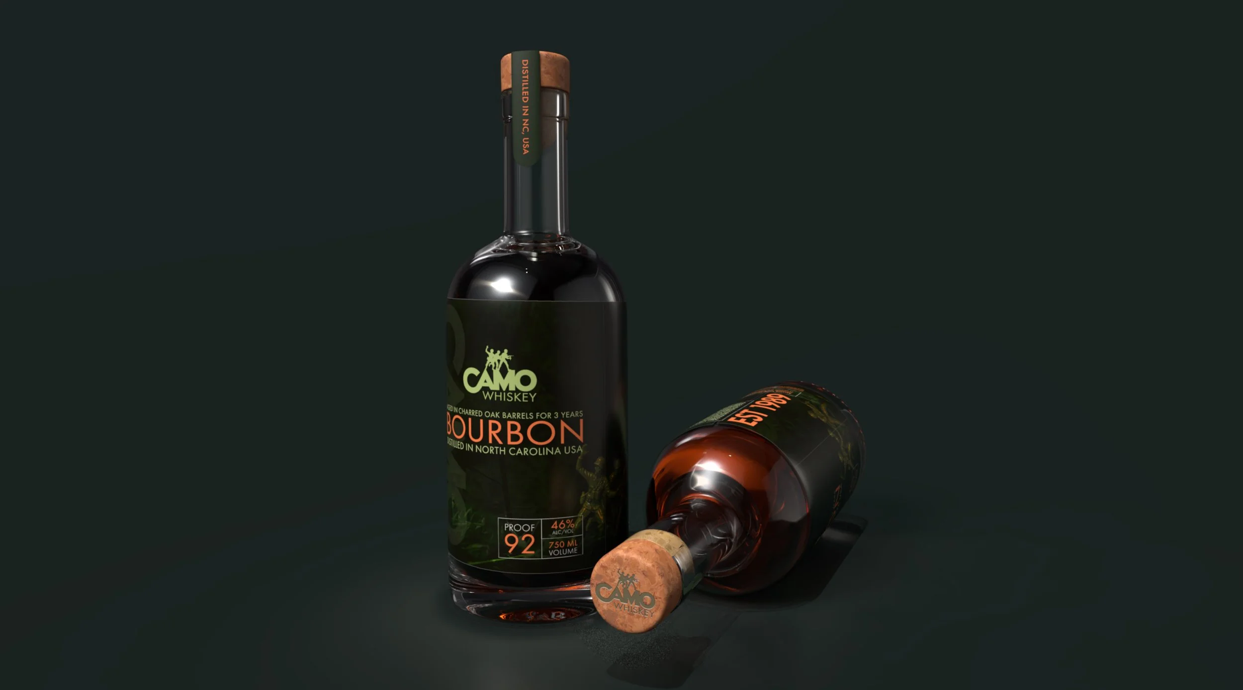
I extensively researched my natural phenomenon, camouflage, through outdoor photography, note-taking, sketching, and endless brainstorming, adapting at each step of the process. The result was an evolution into a logo, a custom color palette, and visual elements reflected in the product design and the brand’s story. Camo Whiskey was created by three veterans on a new mission: to build a whiskey company that would bring people together.
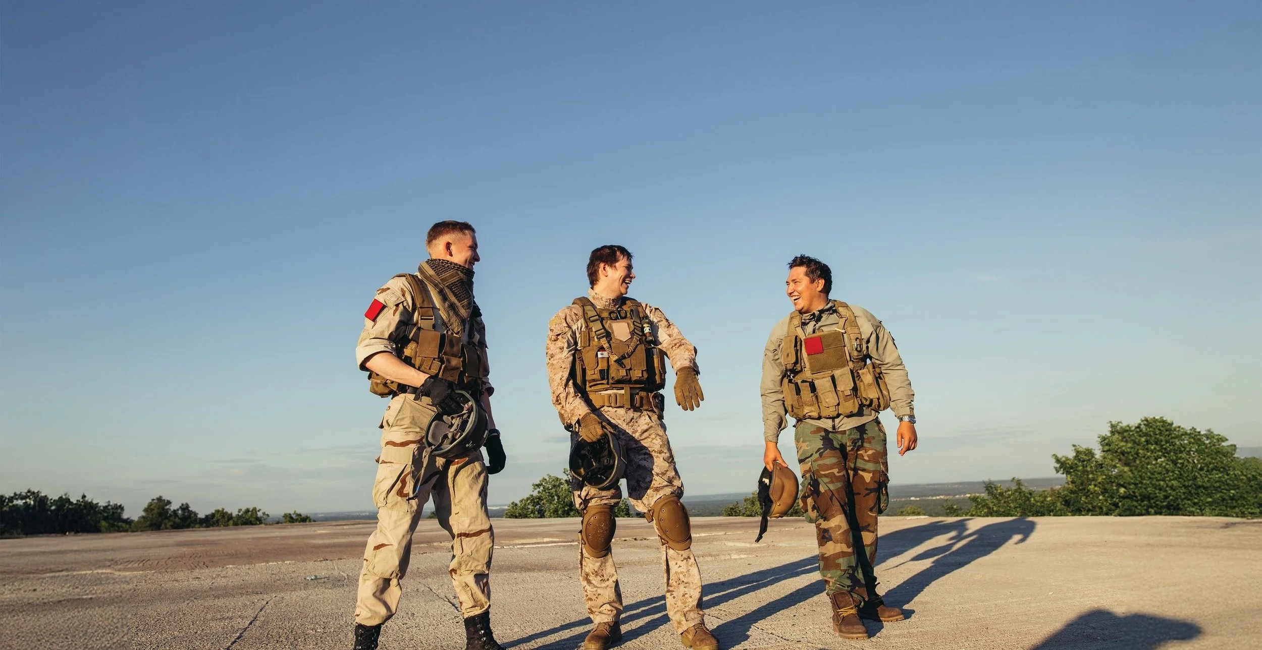
The product fosters connection, camaraderie, and storytelling. The brand’s goal is to have people sip and share tales of bravery, resilience, and friendship. The branding also embodies versatility, appealing to a wide audience by blending rugged authenticity with refined craftsmanship, making Camo Whiskey the perfect fit for both rustic adventures and sophisticated gatherings.


